
Every paint colour I used in my home
Every single one of them plus finishes and a couple of tips ...

Paint colour; the most exciting and challenging part of a renovation (or any redecoration really)! Exciting because, finally, after months, weeks and days of living in total misery, amongst rubble and dust, eating pot noodles, you are one step closer to turning your house into a home! Challenging, however, because choosing a paint colour can feel tricky and daunting!
“What paint colour is that?” is probably one of the most asked questions on Instagram. So let me give you a short recap of my colour story. I was adamant that the colours used throughout the house should feel coherent. A “red thread” if you like. Yet with different shades for each room to work with the light available. The last thing I wanted was the house, and each room, to feel disconnected from each other. Being me, I know I tend to think I want to go bold (absolutely the fault of my Pinterest obsession with collecting pictures of old houses). Still, in reality, I love a neutral base. Doing so allows me to more freely layer the rooms with coloured and patterned furniture and decor, without it feeling too overwhelmed with colour. Evidently, I opted out of using strong and bold colours for the walls and went for a neutral colour palette *gasp*.
But opting out of strong and bold colours doesn’t mean that the house is white and boring. On the contrary! Neutral can be earthy, textured and colourful! When I have painted a room in a colour (such as the hallway, and bathroom) I’ve opted for a more earthy and muted version so as to fit it within the overall colour scheme. And of course, there is a bold colour thrown in there for good measure, such as the brownish-red kitchen. Personally, I would call my home colourfully cautious (yes, I’m making up words as I go ….!).
A couple of tips before sharing the colours I’ve used in my home. As an interior stylist, I work with a lot of clients on paint decisions. So I thought I’d share some tips if you’re at the stage of asking yourself “What colour should I paint this room?”:
Always consider the feeling of the room - how do you want to feel in that room? Is it a room where you want to host, where you want to snuggle up, watch TV, hang out with family? When you know what purpose the room should serve, it is important to think about the light. Spend a bit of time in the room to figure out where the sun rises and sets, and where the light comes in.
This brings us to the issue of undertones and why the light of the room is important to consider when choosing your colours, especially if you’re painting your room in a neutral colour. If going for a neutral colour, a north-facing room should have more of a yellow-pigmented colour to stop the room from feeling too cold, and south-facing rooms can take more bluer-toned, colder white.
If you’re debating between colours, always go for the slightly earthier hue of the shades. Sometimes a little earthier and lighter is just easier to live with and if you feel it’s too tame then you can always opt for the stronger version once you’ve lived there for some time.
This brings me to my last key tip; it is just paint! And while I know paint can be expensive and daunting, always remember, that if you hate it and don’t feel like it’s right, you can always repaint. Take it from someone who has repainted her kitchen 5 times ….. (yes, that’s something I’ve never shared but it was green, red, yellow, white and then back to red… don’t judge me haha).
One more thing; remember that paint is one of those things that can look differently depending on light and the material painted on. So below I’ll also give a brief description of these elements and pictures of the space in a different light so you can get a better idea.
OK! I’ll stop babbling on now … so here are all the paint colours I’ve used (so far) in my home.
ps. If you’re reading this in your email, you may need to click “expand” to read all the way to the end. Sometimes email platforms cut newsletters off if they’re too long!
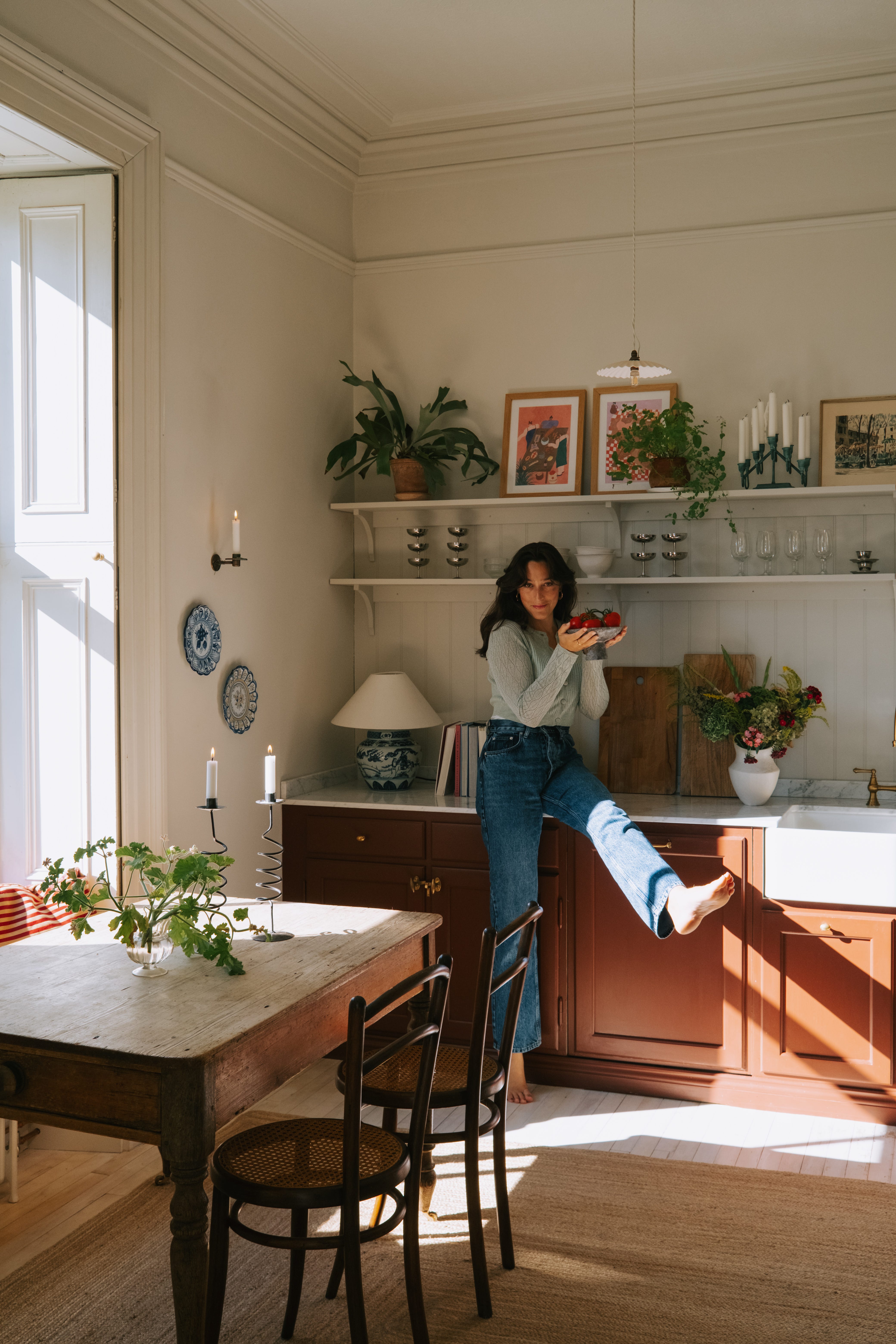
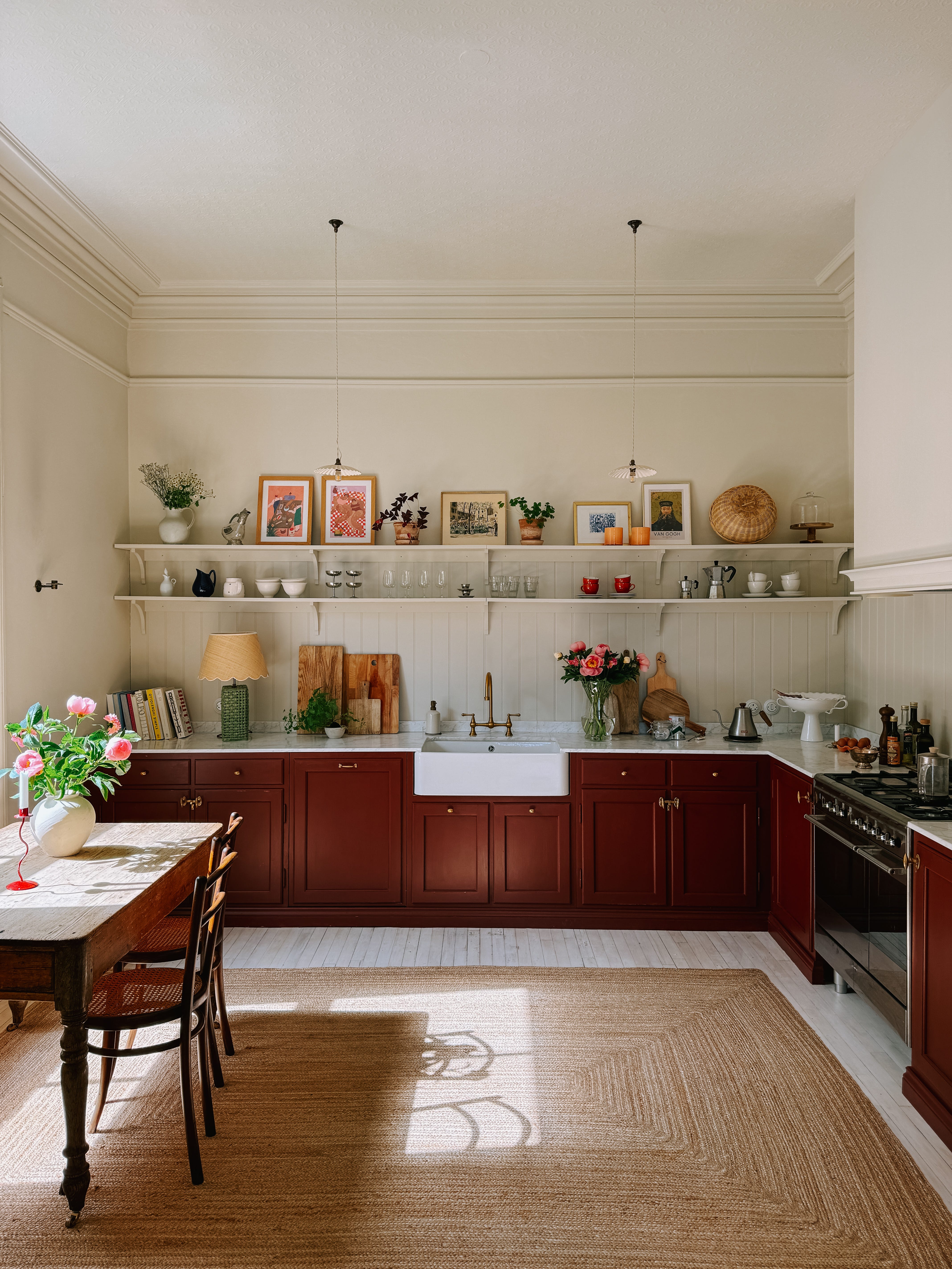
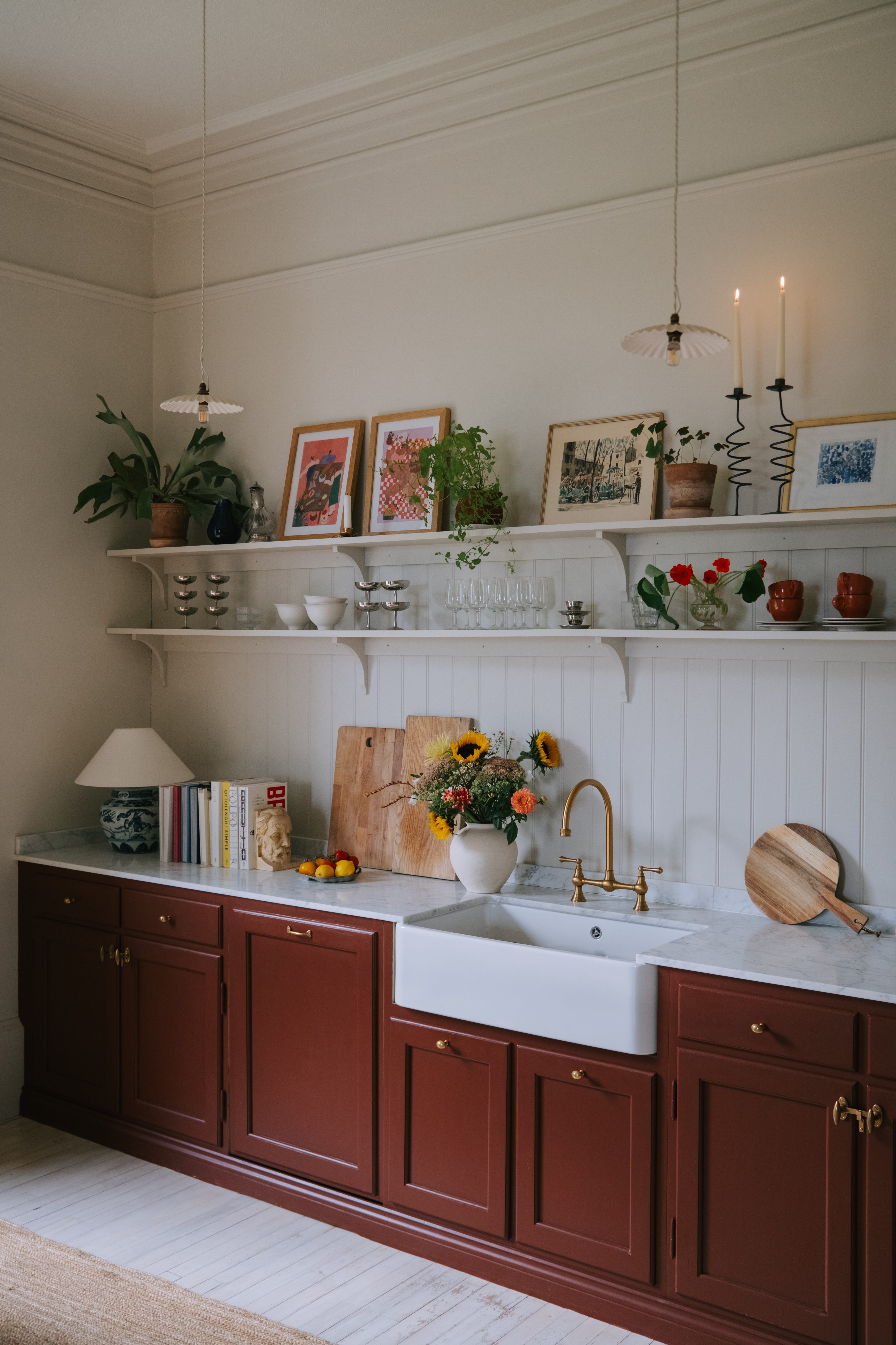
Kitchen
West facing, somewhat dark throughout the day, with afternoon and evening light.
Walls (newly plastered) and ceiling: Little Green’s Portland Stone Pale (intelligent matt)
Skirting boards & windows: Little Green’s Portland stone Pale (intelligent eggshell)
Wooden kitchen cupboards: Paint & Paper Library scarlet and rust
Wallpanneling (wood): Little Green’s Portland Stone Light (intelligent eggshell)
Dining room
South and west-facing, late morning and afternoon light.