I’m not someone who jumps on the trend bandwagon, overhauling my interiors or wardrobe every time the design world declares something “in” or “out.” But I do enjoy watching the ebb and flow of trends—how colours sneak or strut into the spotlight with the change of seasons. It’s like a stylish game of déjà vu: everything old is new again, but with just enough of a twist to feel fresh. The predictions might not dictate my choices, but they often deliver a spark of inspiration—particularly handy if you’re staring at a blank wall (literally or figuratively) and contemplating a redecoration project.
Now, as 2025 rolls in and the design world rubs its eyes after a long Christmas nap, it’s time to look ahead. Let me share four colours (and inspiration pictures) poised to take centre stage this season—whether you’re redecorating, dreaming, or just curious to see where the palette wheel lands next.
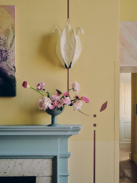
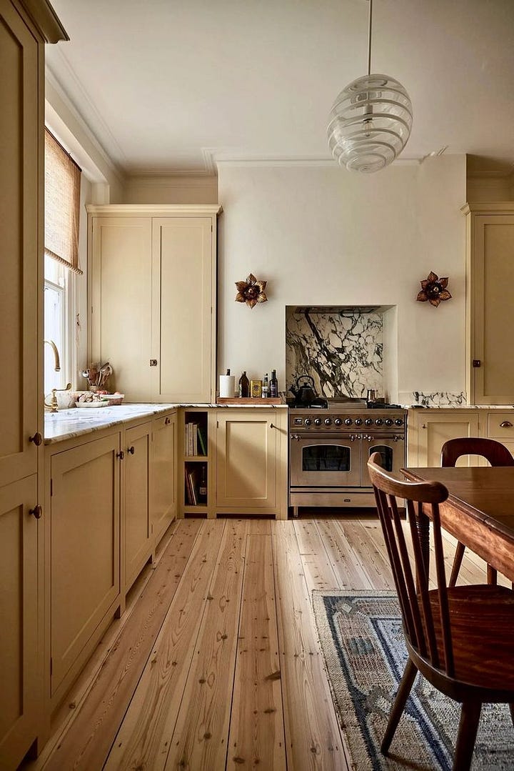
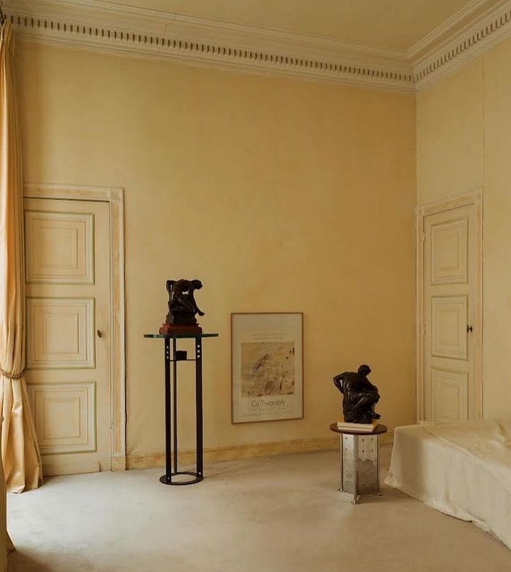
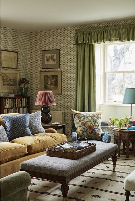
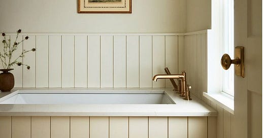
SOFT YELLOW
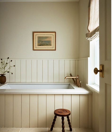
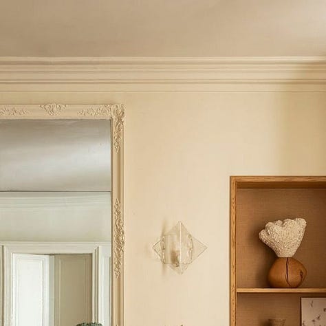
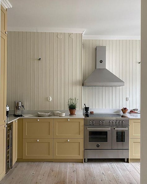
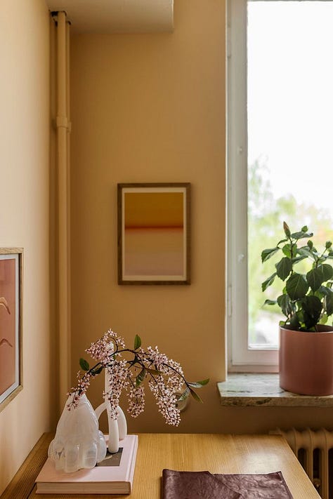
There’s a house I pass on my drive into town, peeking shyly through the forest. It’s painted the most beautiful buttery white—utterly dreamy. Now, I’m not one to base predictions on woodland facades, haha, but I have a hunch lighter, softer shades of yellow will be making a splash this year. Think of it as white’s charmingly versatile cousin—just as elegant but with a touch more personality. I’ve embraced the trend myself, painting my bathroom in the archived Farrow & Ball shade 'Orange Coloured White.' It’s sophisticated, elegant, and somehow manages to feel wonderfully cosy all at once

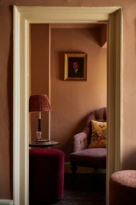
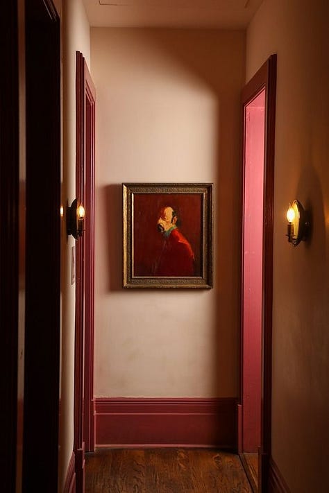
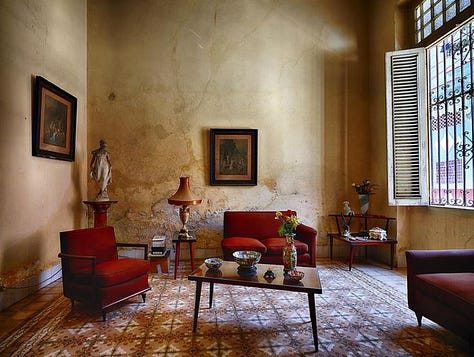
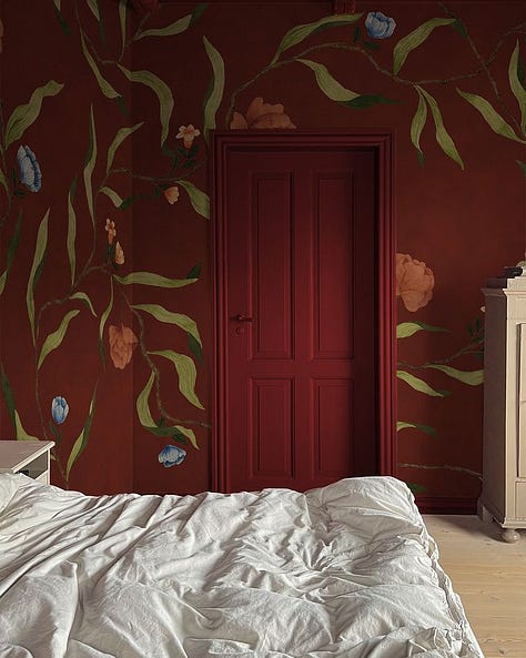
DEEP REDS
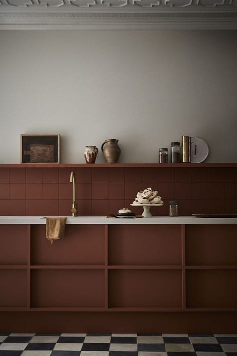
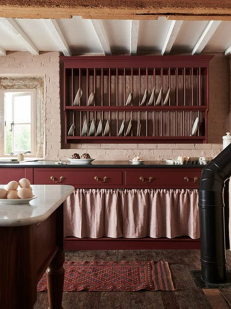
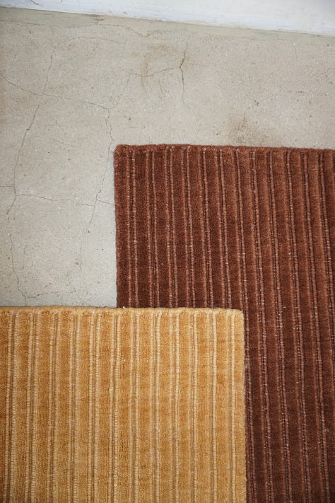
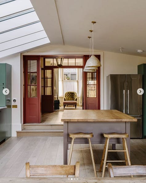
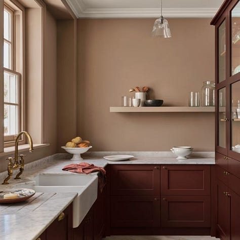
I know what you’re thinking—no, painting my kitchen red didn’t make me a trend oracle, haha! But I must say, this one’s a fabulous prediction. Deep, zesty reds, warm terracotta tones, and soft clay pinks are stealing the spotlight in interiors. They’re especially irresistible when paired with buttery yellows and earthy neutrals.
There’s no surprise that Pantone’s colour of the year for 2025 was Mocha Mouse! This shade is elegant and can be used for a subtle accent, on joinery or if you’re brave as the foundation for a full-room transformation!
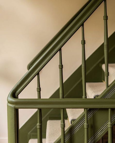
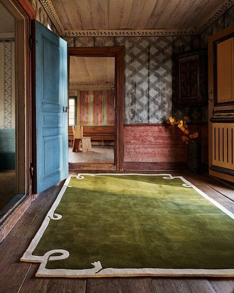
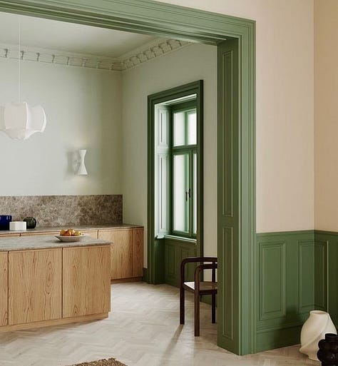
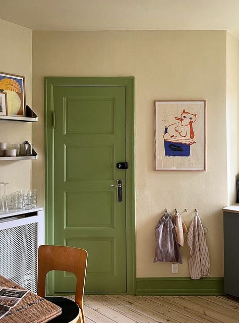
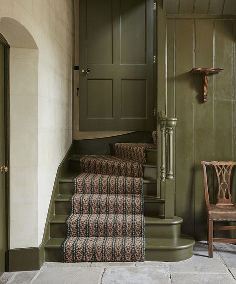
MOSS GREEN
Moss green—calm, earthy, and unmistakably fresh! I’ve seen it loads and I’m loving it. The colour is a reminder to slow down and let your space exhale a little calm.
This shade works particularly well for joinery and woodwork, as well as soft furnishing. Pair it with soft neutrals for a serene, natural feel, or layer it with deep jewel tones for something bolder. Whether it’s a cosy throw, an accent wall, or even a moss-green coffee press, this colour brings a quiet confidence to any room—a hint that spring is never too far away.
ps. I’m going to repaint my stairs moss green after seeing these pictures!
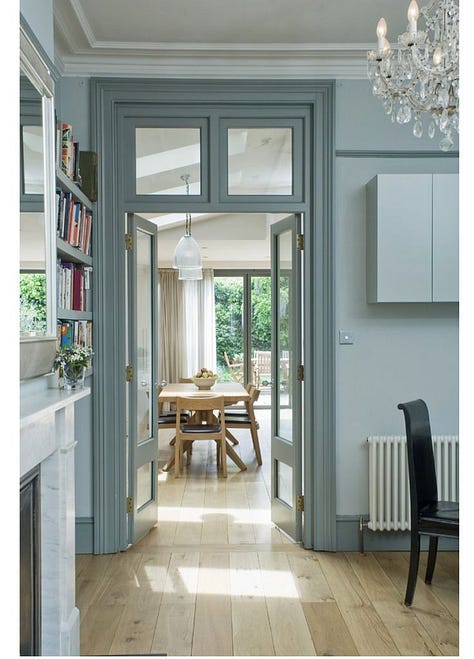
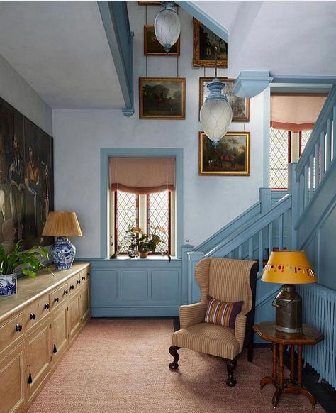
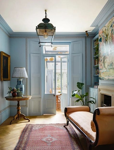
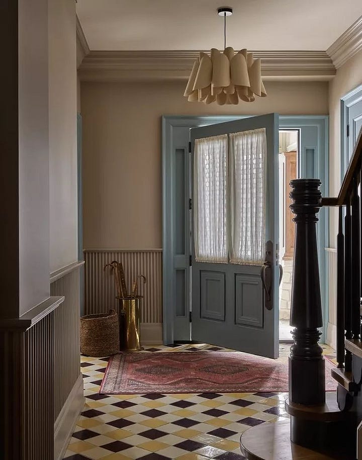
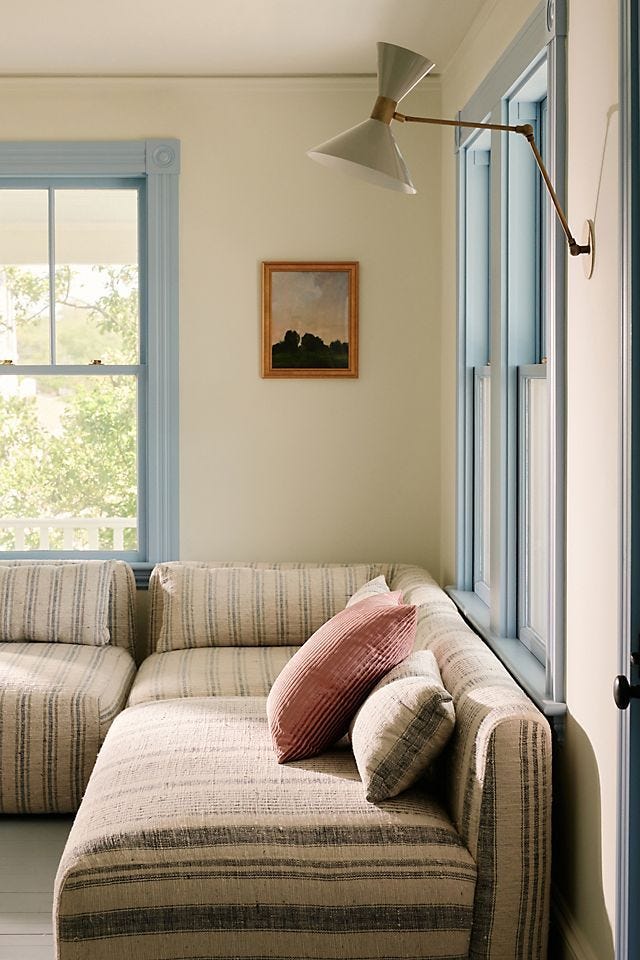
PARMA GREY (BLUE)
A shade that never really went away but that I think we will see more and more is Parma Grey. Let’s face it, it is a heritage blue, but a bit softer and cooler than your baby blue. Using this even in the smallest proportion will elevate any scheme.



Ooo I love all of this inspiration! Thank you so much, Patricia! The soft yellow is my fav 🙏🏻
Honestly, this makes me question if I even like the things that I think I like, or if it is just my brain being exposed to trendy colours and then me subconsciously choosing them😅 Been renovating for the last year or so, moss green and light, warm yellow are my two main colours, and I’m still trying to find the best way to add in a touch of that gorgeous deep red😍